前言
"舔狗",网络用语,指那些不顾一切去讨好他人的人。
俗话说,人在职场走哪能不添狗,虽说这是职场化解矛盾的利器之一,但是作为伟大而骄傲的程序员岂能不顾一切的去舔狗,于是乎能自己动手的绝不舔。
就像跟UI的大战,让给你改个图能叨叨你半天,切个图,画个图,那口水战那绝对是一个持久战,此外不说可能给你的图还不能用...
总之,能自己动手的,别叨叨,自己动手丰衣足食
书签
就拿常用的一些图标来说,自己完全可以实现嘛,自己动手喽。
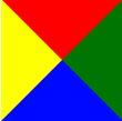
在开始之前我们先来重温 border的属性以及各个边框颜色的设置
1
2
3
4
5
6
.border-co{
width: 100px;
height: 100px;
border: 100px solid;
border-color: red green blue yellow;
}
效果如下:
下面是一个书签的展示:
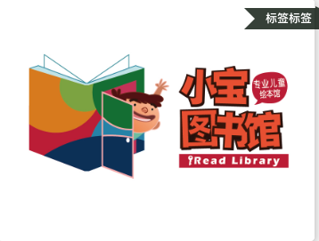
想要实现右上角的标签,可以分为三部分,夹角、文字、最右边的小角,按照思路我们可以想象夹角和小角可以看做是一个div的一部分,那么我们可以通过设置背景色和border的宽度来实现。 先看布局:
1
2
3
4
5
6
<div class="img-box">
<img alt="" src="./images/new_user_welcome.jpeg">
<div class="tag-t-box">
<span class="txt">标签标签</span>
</div>
</div>
再来看下样式:
1
2
3
4
5
6
7
8
9
10
11
12
13
14
15
16
17
18
19
20
21
22
23
24
25
26
27
28
29
30
31
32
33
34
35
36
37
38
39
40
41
42
43
44
45
46
47
48
49
50
51
52
53
54
55
56
.img-box{
      width: 100%;
      padding-bottom: 20px;
      position: relative;
      img{
        display: block;
        width: 100%;
        border-radius: 9px;
        box-shadow: 4px 4px 14px 0 rgba(64, 60, 60, 0.22);
      }
      .tag-t-box{
        position: absolute;
        right: -10px;
        top: 20px;
        background: rgba(1, 14, 2, 0.8);
        width: 120px;
        line-height: 48px;
        text-align: left;
        height: 48px;
        color: #fff;
        font-size: 26px;
        font-weight: bold;
        // 小角
        &::before {
          content: '';
          position: absolute;
          top: -4px;
          right: 0;
          border: 4px solid rgba(1, 14, 2, 0.8);
          border-top-color: transparent;
          border-right-color: transparent;
          border-top-width: 2px;
          border-bottom-width: 2px;

        }
        // 夹角
        &::after {
          content: '';
          position: absolute;
          right: 120px;
          z-index: 1;
          width: 0;
          height: 0;
          line-height: 0;
          color: #21232e;
          border: 24px solid rgba(1, 14, 2, 0.8);
          border-left-color: transparent;
          border-left-width: 24px;
          /*padding-right: 3px;*/
          text-align: left;
          text-decoration: none;
          font-size: 24px;
        }
      }
    }
我们来分析一下代码首先看小角的,设置了 border: 4px solid rgba(1, 14, 2, 0.8); 可以看出高度是4px,然后 border-top-color: transparent;和 border-right-color: transparent; 右上的颜色设置为透明,这样右上角就没了, 再设置 border-top-width: 2px;和border-bottom-width: 2px; 撑开剩余的高度(PS:这两块不设置也是可以的,只是显示的那一部分小了2px,看实际需要的小角的大小来决定)
接着我们再来看看夹角的,因为夹角是向左的结合刚开始的border的各个属性,我们可以设置左侧的border颜色为#fff或者border-left-color: transparent;设置为透明色(PS:透明色百搭)
理解了这个那么我们的书签就实现了下边是各种方向的书签效果
实现代码:
1
2
3
4
5
6
7
8
9
10
11
12
13
14
15
16
17
18
19
20
21
22
23
24
25
26
27
28
29
30
31
32
33
34
35
36
37
38
39
40
41
42
43
44
45
46
47
48
49
50
51
52
53
.img-box{
width: 100%;
/*border-radius: 9px;*/
padding-bottom: 20px;
position: relative;
img{
display: block;
width: 100%;
border-radius: 9px;
box-shadow: 4px 4px 14px 0 rgba(64, 60, 60, 0.22);
}
.tag-t-box{
position: absolute;
left: -10px;
bottom: 40px;
background: rgba(1, 14, 2, 0.8);
width: 120px;
line-height: 48px;
text-align: right;
height: 48px;
color: #fff;
font-size: 26px;
font-weight: bold;
&::before {
content: '';
position: absolute;
left: 120px;
z-index: 1;
width: 6px;
height: 0;
line-height: 0;
color: #21232e;
border: 24px solid rgba(1, 14, 2, 0.8);
border-right-color: #fff;
border-right-width: 24px;
text-align: left;
text-decoration: none;
font-size: 24px;
}
// 夹角
&::after {
content: '';
position: absolute;
top: -4px;
left: 0;
border: 4px solid rgba(1, 14, 2, 0.8);
/*border-top-width: 2px;*/
/*border-bottom-width: 2px;*/
border-left-color: transparent;
border-top-color: transparent;
}
}
}
1
2
3
4
5
6
7
8
9
10
11
12
13
14
15
16
17
18
19
20
21
22
23
24
25
26
27
28
29
30
31
32
33
34
35
36
37
38
39
40
41
42
43
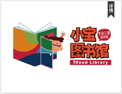
44<div class="img-box2">
<img alt="" src="./images/new_user_welcome.jpeg">
<div class="tag-p-box1">
<div class="txt">详情</div>
</div>
</div>
.img-box2{
width: 100%;
/*border-radius: 9px;*/
padding-bottom: 20px;
position: relative;
img{
display: block;
width: 100%;
border-radius: 9px;
box-shadow: 4px 4px 14px 0 rgba(64, 60, 60, 0.22);
}
.tag-p-box1{
position: absolute;
top: 0;
right: 40px;
height: 100px;
border: 20px solid rgba(1, 14, 2, 0.8);
border-bottom-width: 20px;
border-bottom-color: transparent;
box-sizing: border-box;
.txt{
display: inline-block;
position: absolute;
top: -28px;
left: -20px;
width: 40px;
height: 100px;
line-height: 40px;
writing-mode: vertical-lr;
text-align: center;
color: #fff;
font-size: 26px;
font-weight: bold;
}
}
}
虽然border:1px solid black看起来很简单,但是对我们的帮助很大,充分发挥我们的脑洞,拒接向UI低头
我们伟大的程序员无所不能